Perigee branding
Client : Perigee construction
My role: Art Director and Designer (As the sole designer and art director for the Perigee Construction branding project, I was responsible for conceptualizing and executing the entire brand identity.)
Project Overview: Perigee Construction approached me with a unique branding challenge. The company name, “Perigee,” refers to the point in the orbit of an object orbiting the Earth that is nearest to the centre of the Earth. This concept of proximity and closeness was central to the brand identity we aimed to create.
Design Concept: Drawing inspiration from the meaning of “Perigee,” I designed a logo that symbolizes the closest point of connection, reflecting the company’s commitment to building strong, reliable structures that stand the test of time. The logo integrates elements that evoke stability and precision, essential qualities in the construction industry.
Deliverables
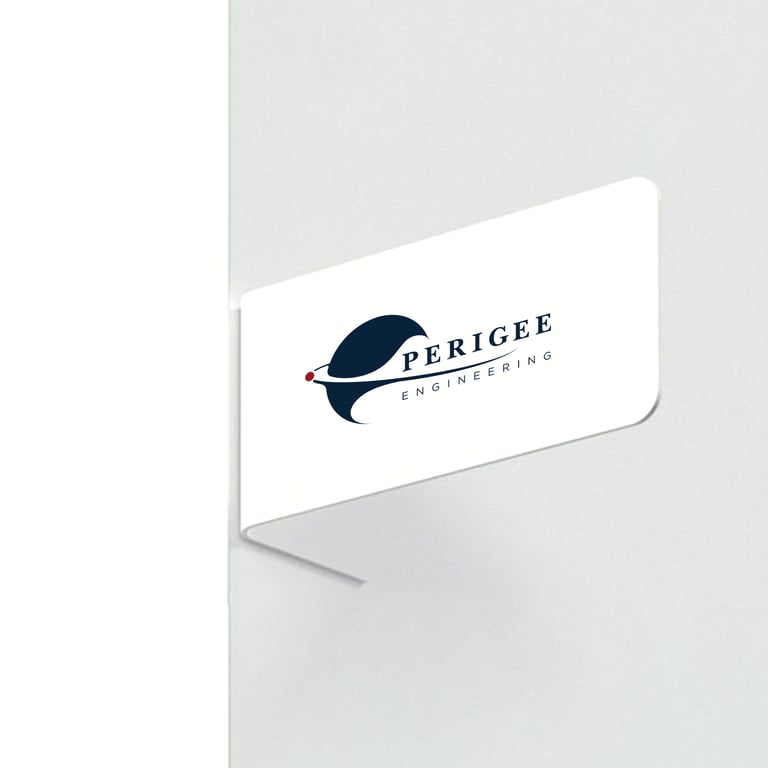
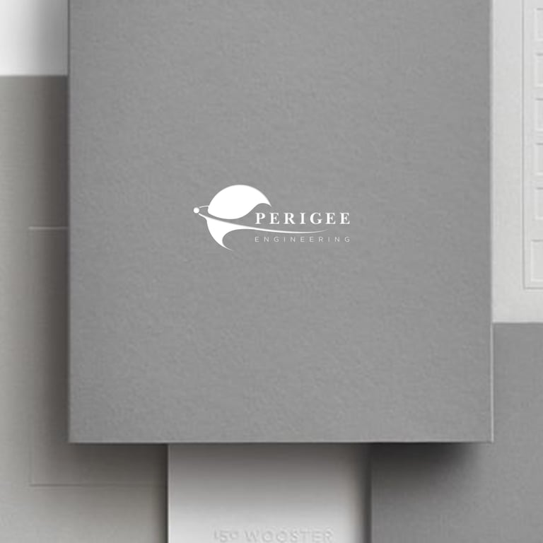
Logo Design: A visually compelling logo encapsulates the essence of “Perigee” and its significance in construction
Colour Palette: A cohesive set of colours that convey trust, strength, and professionalism
Typography: Carefully selected fonts that enhance readability and brand recognition
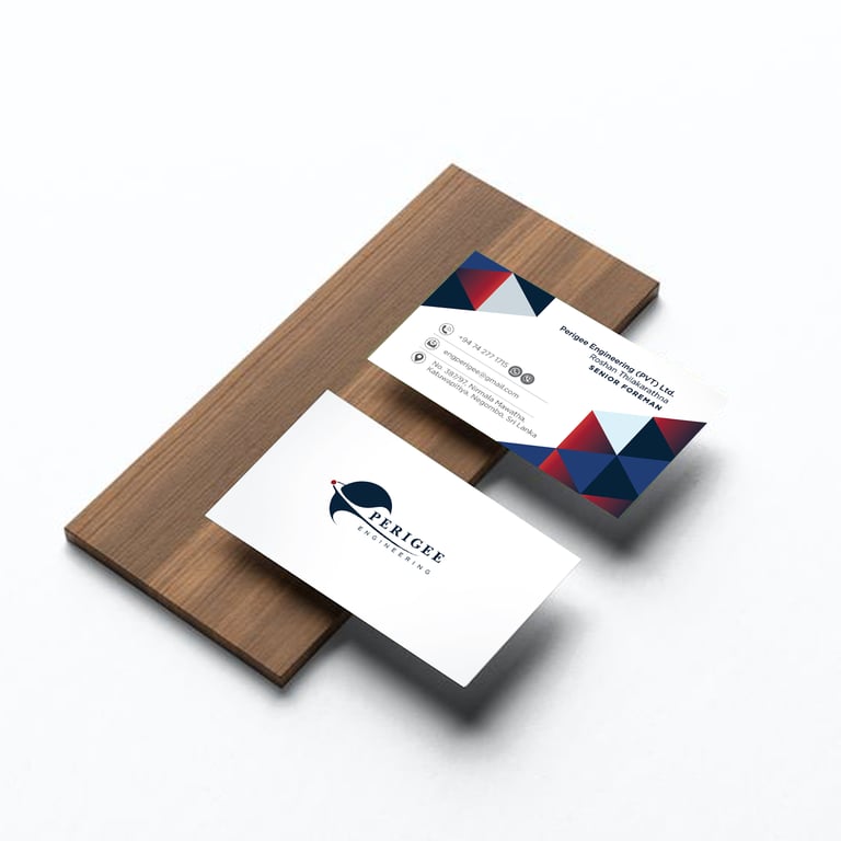
Business Card: Professionally designed business cards that leave a lasting impression
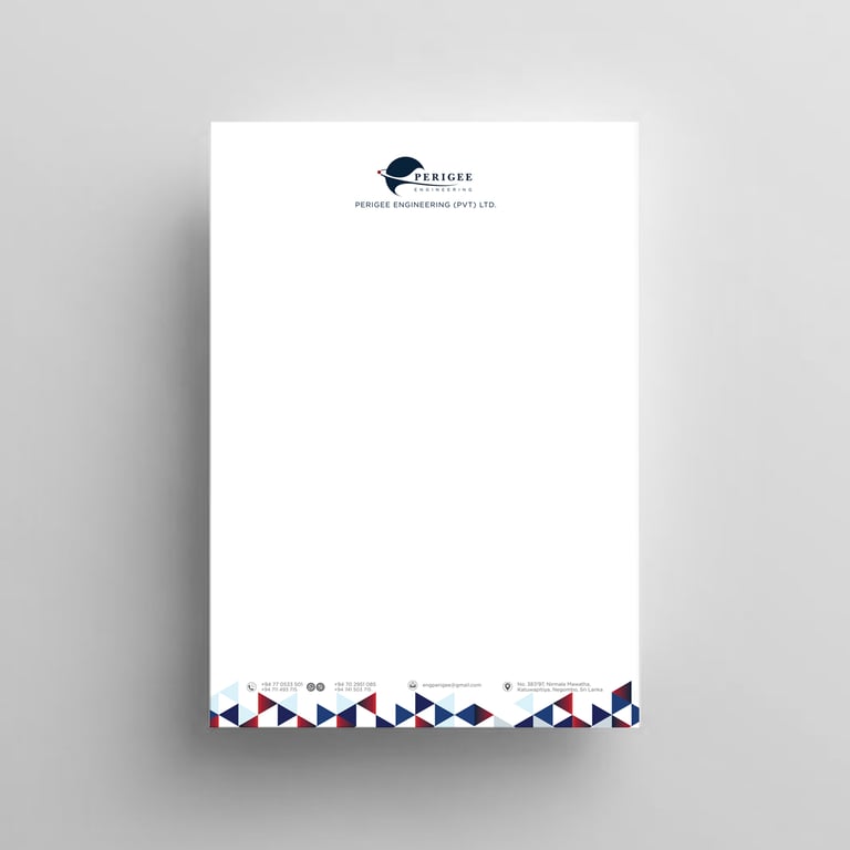
Letterhead: Elegant letterhead designs for official correspondence
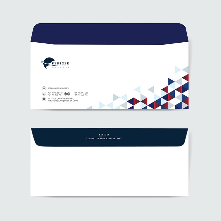
Envelopes: Custom envelopes that align with the overall brand aesthetic
Company Profile: A comprehensive company profile that showcases Perigee Construction’s expertise and services
Outcome: The branding project for Perigee Construction successfully translated the unique concept of “Perigee” into a strong visual identity. The cohesive brand elements not only reflect the company’s core values but also enhance its professional image in the construction industry.