BRANDING
Explore a range of completed client projects and case studies developed through research and brand strategy, created for both local and global brands.
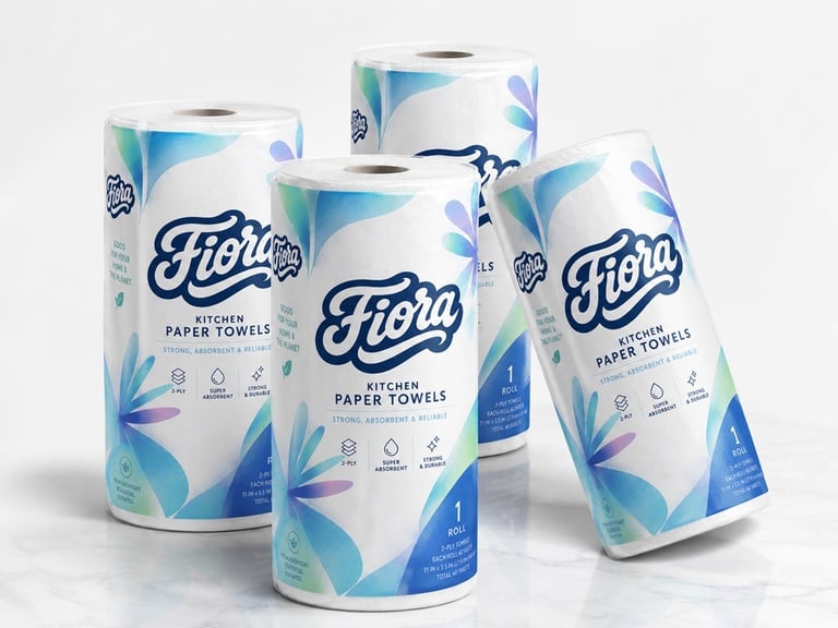
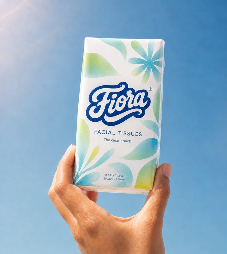
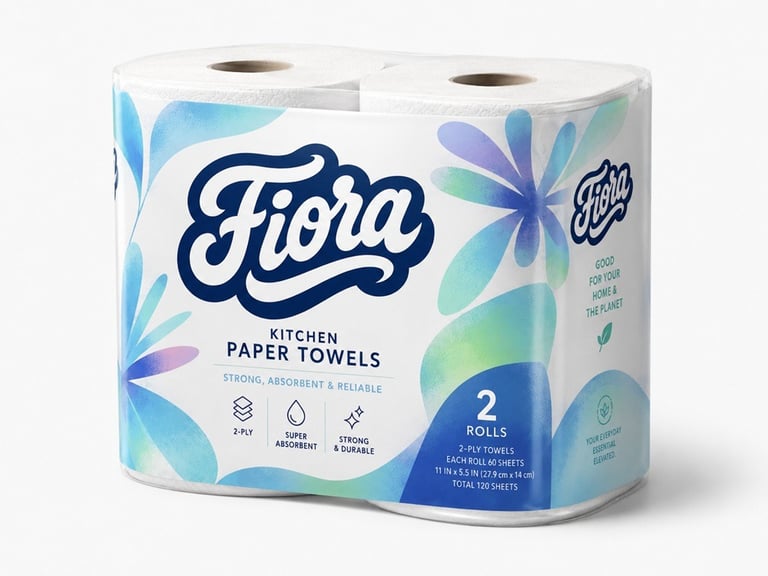
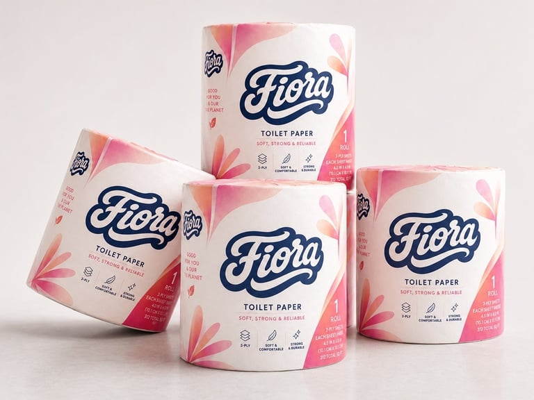
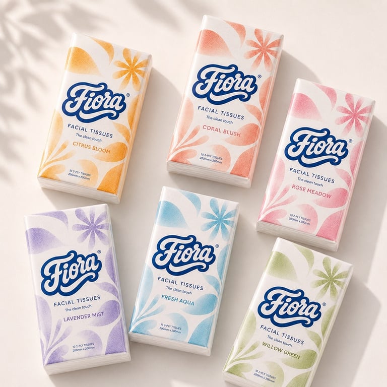
Fiora Branding & Packaging
Client : Fiora
My Role: Art Director and Designer (As the sole designer and art director for this project, I was responsible for conceptualizing and executing the entire brand identity and packaging design.)
Project Overview: Fiora is a full‑spectrum brand refresh that turns a commodity into a confident retail presence. I developed the logo, a flexible packaging system, the broader brand identity, and a set of advertising asset, all engineered to increase shelf recognition, shorten shopper decision time, and lift perceived value.
The wordmark and floral motif were crafted for instant legibility at shelf scale and tactile appeal up close; the packaging system uses repeatable patterns and color cues so variants (kitchen, facial, toilet) read as a cohesive family while remaining production‑friendly.
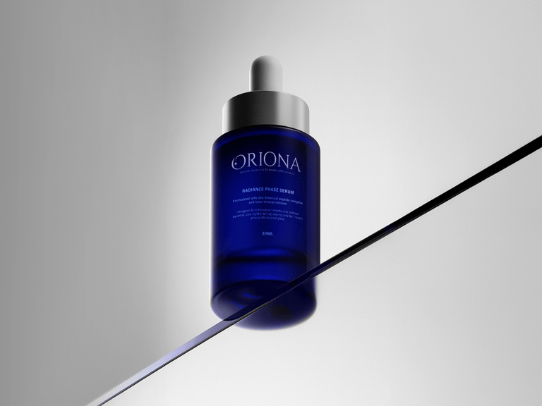
Oriona branding
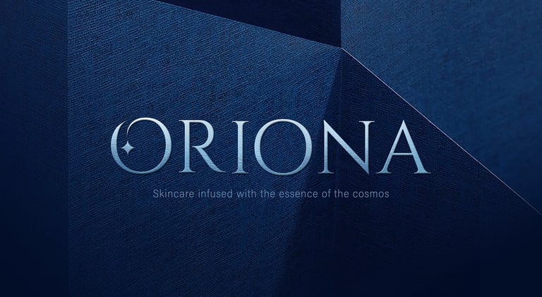
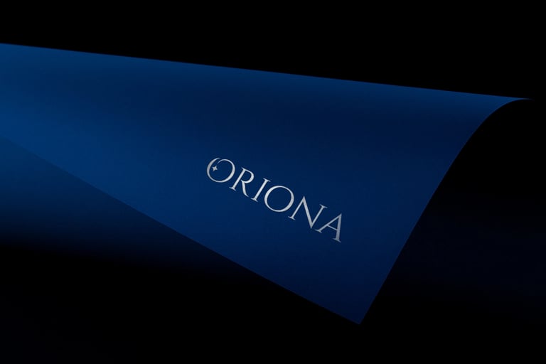
Client : Oriona
My Role: Art Director and Designer (As the sole designer and art director for this project, I was responsible for conceptualizing and executing the entire brand identity.)
Project Overview: Oriona is an ethical skincare and wellness brand that bridges the mysteries of the cosmos with the purity of nature. Guided by lunar cycles and inspired by celestial energies, Oriona offers products that transform daily care into intentional rituals. Each formula is crafted with sustainably sourced botanicals and infused with the symbolism of stars, moons, and planetary rhythms reminding us that beauty is not only skin deep, but a reflection of universal harmony.
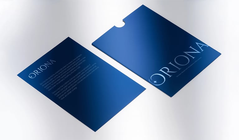
Colour Choices
Core palette: White and silver communicate purity, clinical precision, and moonlight clarity.
Deep blue introduces depth, mystery, and night-sky calm, anchoring the ritual aspect without sacrificing sophistication.
Contrast and hierarchy: High contrast between light surfaces and dark accents creates immediate legibility for product names and lines, while subtle tonal shifts (matte vs. gloss) add dimension without visual noise.
Emotional tone: The palette supports a journey from renewal to reflection, bright, clean tones for efficacy; saturated blues for introspection and ritual.
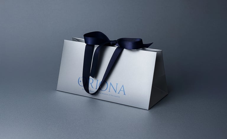
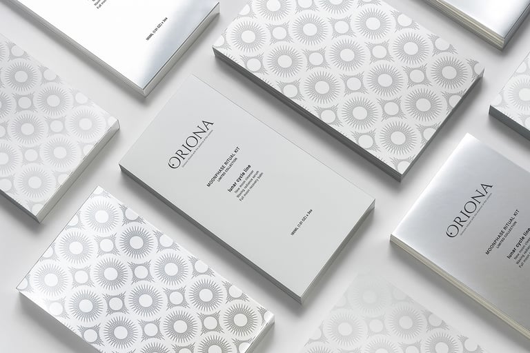
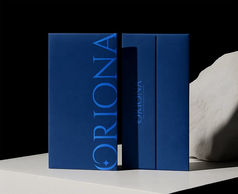
Packaging
Surface treatments: Minimal graphics, precise alignment, and selective finishes (matte stocks, foil/satin metallics, ribbon details) signal premium craftsmanship while echoing lunar sheen.
Oriona branding
Project Overview: Oriona is an ethical skincare and wellness brand that blends cosmic inspiration with natural purity. As the art director and designer, I created a complete brand identity, from concept to execution, using a palette of moonlit whites, silvers, and deep blues to evoke clarity, mystery, and ritual. Minimal packaging with premium finishes reflects lunar elegance, while the overall design transforms daily care into intentional, harmonious rituals.
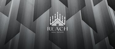
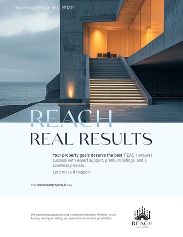
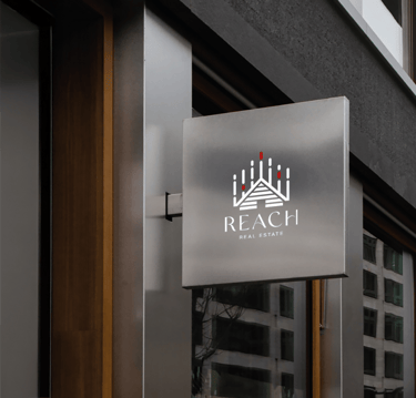
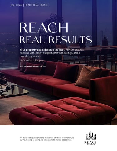
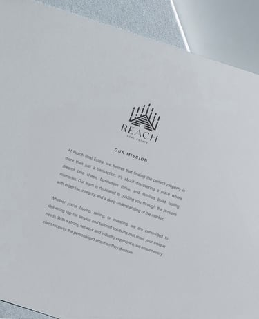
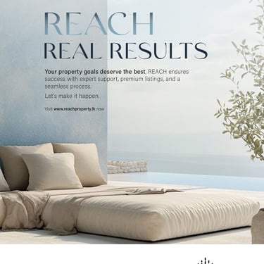
Reach Real Estate Branding
Client: REACH Real Estate
Audience:
Homebuyers, business owners, investors and brokers covering both residential and commercial segments. It aimed to appeal to first-time buyers, upscale clients, startups, corporate entities, and seasoned real estate professionals.
My role:
Art Direction and Graphic creation
About REACH:
REACH is a Sri Lanka-based real estate company dedicated to fulfilling the commercial and residential property needs of its clients. Whether buying, renting, or selling properties, REACH provides unmatched opportunities and support, helping turn real estate aspirations into reality.
Project Scope:
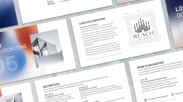
Logo Design, Brand Identity Creation, Art Direction
The assignment focused on developing a cohesive brand identity, including a distinctive logo design. This process involved gaining a deep understanding of the company’s values, target audience, and market positioning. I started by conducting thorough industry research, analyzing competitors, and identifying trends that resonate with potential clients.
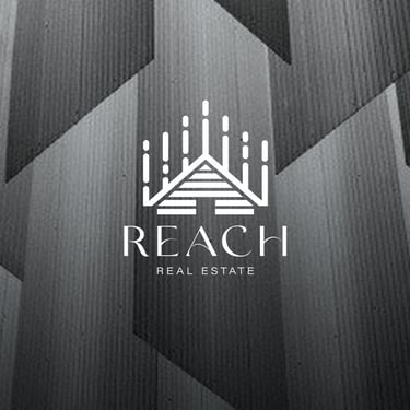
Concept:
The Reach Real Estate logo features a stylized house shape as its central symbol, representing the essence of home. The structure, with distinct upward lines, signifies growth, expansion, and ambition. These elements reflect progress and the company’s dedication to helping clients elevate their real estate experiences.
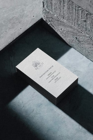
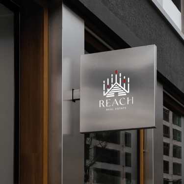
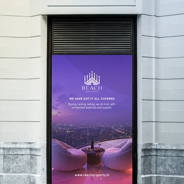
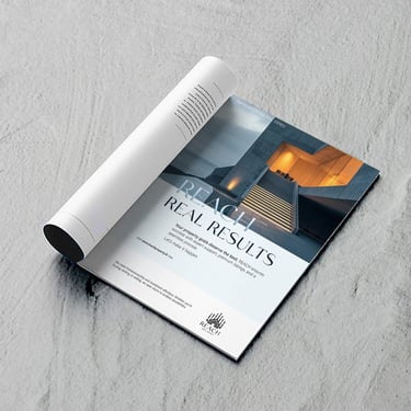
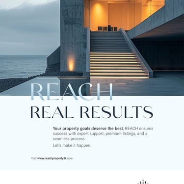
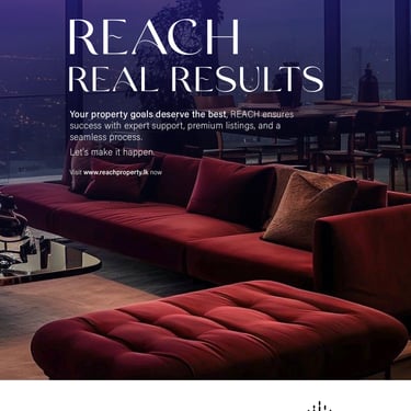
Use cases:
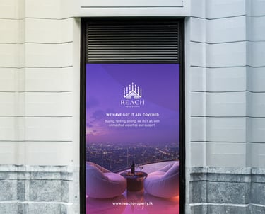
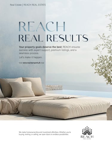
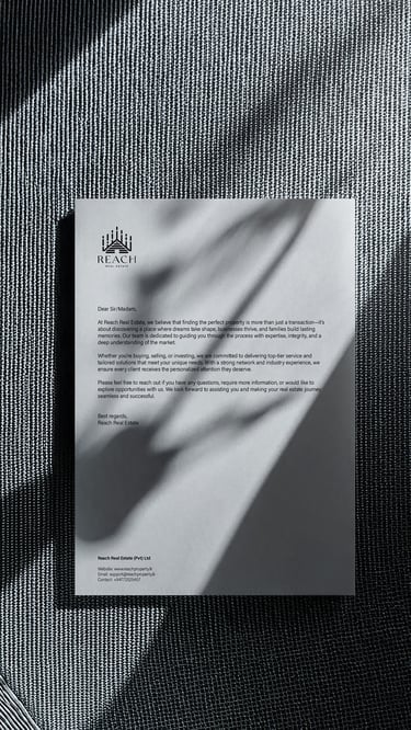
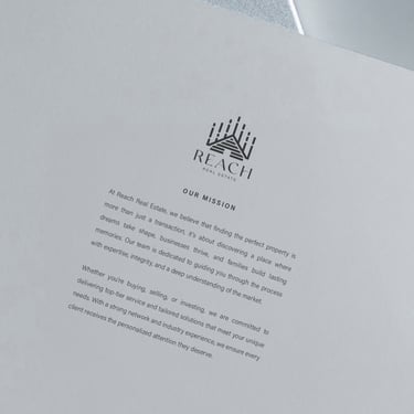
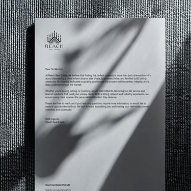
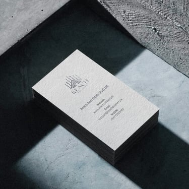
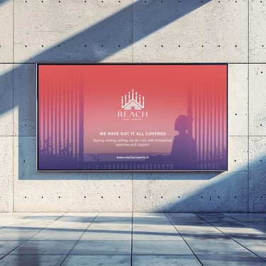
Here REACH brand identity is applied across various touchpoints to ensure consistency and strong visual impact. From large-scale wall branding that enhances corporate spaces to magazine ads that showcase premium property listings, every element reinforces trust and professionalism. Stationery, including business cards and letterheads, maintains a polished brand presence in client interactions, while dynamic social media stories drive engagement and visibility in the digital space. These applications collectively shape a cohesive and recognizable brand experience.

Reach Real Estate Branding
Project overview: REACH Real Estate is a Sri Lanka‑based company serving homebuyers, investors, and businesses across residential and commercial markets. I provided art direction and graphic design to build a cohesive brand identity, including a logo that symbolizes growth and connection. Applied across corporate spaces, print ads, stationery, and social media, the visual system reinforces trust and professionalism while positioning REACH as a reliable partner for turning property aspirations into reality.
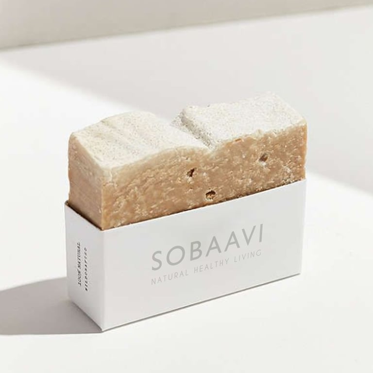
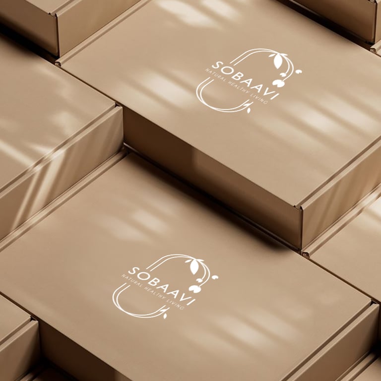
Sobaavi branding
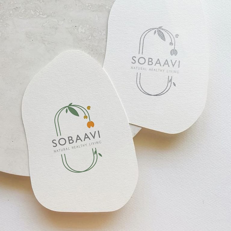
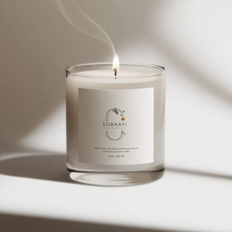
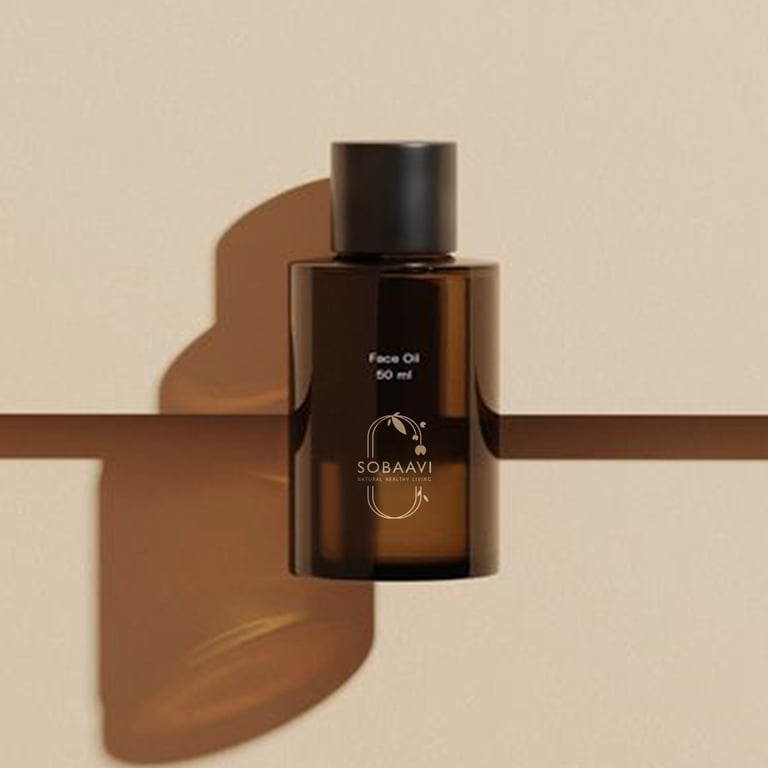
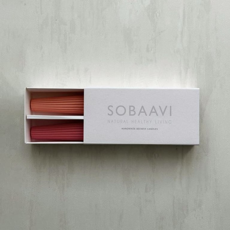
Client : Sobaavi
My Role: Art Director and Designer (As the sole designer and art director for this project, I was responsible for conceptualizing and executing the entire brand identity.)
Project Overview: Sobaavi is a small-scale, homemade brand dedicated to creating all-natural products, ranging from bath powders and cosmetics to candles, incense sticks, healthy snacks, and more. The brand’s mission is to offer natural, eco-friendly products that promote well-being and sustainability.
Design Concept: For Sobaavi, I aimed to create a brand identity that reflects its commitment to nature and simplicity. The design elements were inspired by the natural world, ensuring that the brand’s visual identity aligns with its core values.
Deliverables
Logo Design: Developed a logo that embodies the essence of Sobaavi’s natural and homemade ethos
Colour Palette: Selected hues from nature to create a soothing and organic colour palette that resonates with the brand’s mission.
Typography: Chose fonts that are clean, readable, and complement the natural aesthetic of the brand
Packaging Design: Considering the scale of the business I made sure the packaging design could be implemented at a low cost without compromising on quality or aesthetics
Social Media Campaign: For Sobaavi’s social media, I developed a series of visually appealing posts that highlight the brand’s natural products. Each month featured carefully crafted visuals and engaging content to attract and retain followers
Outcome: The branding project for Sobaavi successfully captured the brand’s dedication to natural and eco-friendly products. The cohesive visual identity, from the logo to the packaging and social media campaign, effectively communicates Sobaavi’s mission and appeals to its target audience.
Check my Behance profile for more details on this project.
Sobaavi branding
Project Overview: Sobaavi is a homemade brand devoted to natural, eco‑friendly products ranging from bath powders and cosmetics to candles and healthy snacks. I directed the creative vision and design, shaping a visual identity rooted in simplicity and nature. From logo and color palette to packaging and social media campaigns, each element was crafted to be cost‑effective yet aesthetically strong, ensuring the brand’s values of sustainability and well‑being are clearly communicated.
Perigee Construction Branding Project
Client : Perigee construction
My role: Art Director and Designer (As the sole designer and art director for the Perigee Construction branding project, I was responsible for conceptualizing and executing the entire brand identity.)
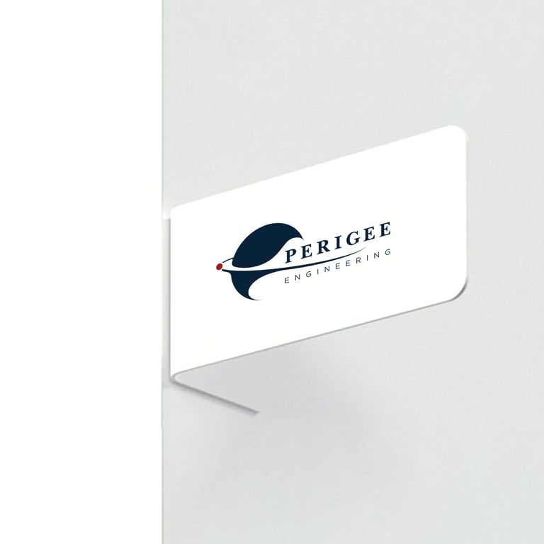
Project Overview: Perigee Construction approached me with a unique branding challenge. The company name, “Perigee,” refers to the point in the orbit of an object orbiting the Earth that is nearest to the centre of the Earth. This concept of proximity and closeness was central to the brand identity we aimed to create.
Design Concept: Drawing inspiration from the meaning of “Perigee,” I designed a logo that symbolizes the closest point of connection, reflecting the company’s commitment to building strong, reliable structures that stand the test of time. The logo integrates elements that evoke stability and precision, essential qualities in the construction industry.
Deliverables
Logo Design: A visually compelling logo encapsulates the essence of “Perigee” and its significance in construction
Colour Palette: A cohesive set of colours that convey trust, strength, and professionalism
Typography: Carefully selected fonts that enhance readability and brand recognition
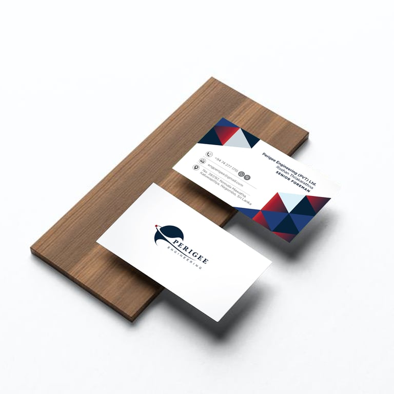
Business Card: Professionally designed business cards that leave a lasting impression
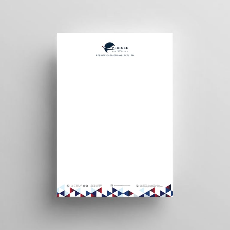
Letterhead: Elegant letterhead designs for official correspondence
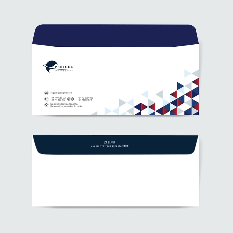
Envelopes: Custom envelopes that align with the overall brand aesthetic
Company Profile: A comprehensive company profile that showcases Perigee Construction’s expertise and services
Outcome: The branding project for Perigee Construction successfully translated the unique concept of “Perigee” into a strong visual identity. The cohesive brand elements not only reflect the company’s core values but also enhance its professional image in the construction industry.
Perigee Construction Branding Project
Project Overview: Perigee Construction’s identity was built around its name, symbolizing the closest point of connection. I led the creative direction and design, developing a logo, color palette, typography, and branded stationery that convey trust, strength, and precision. The result is a cohesive visual system that reflects stability and professionalism, translating the concept of “Perigee” into a distinctive presence within the construction industry.